
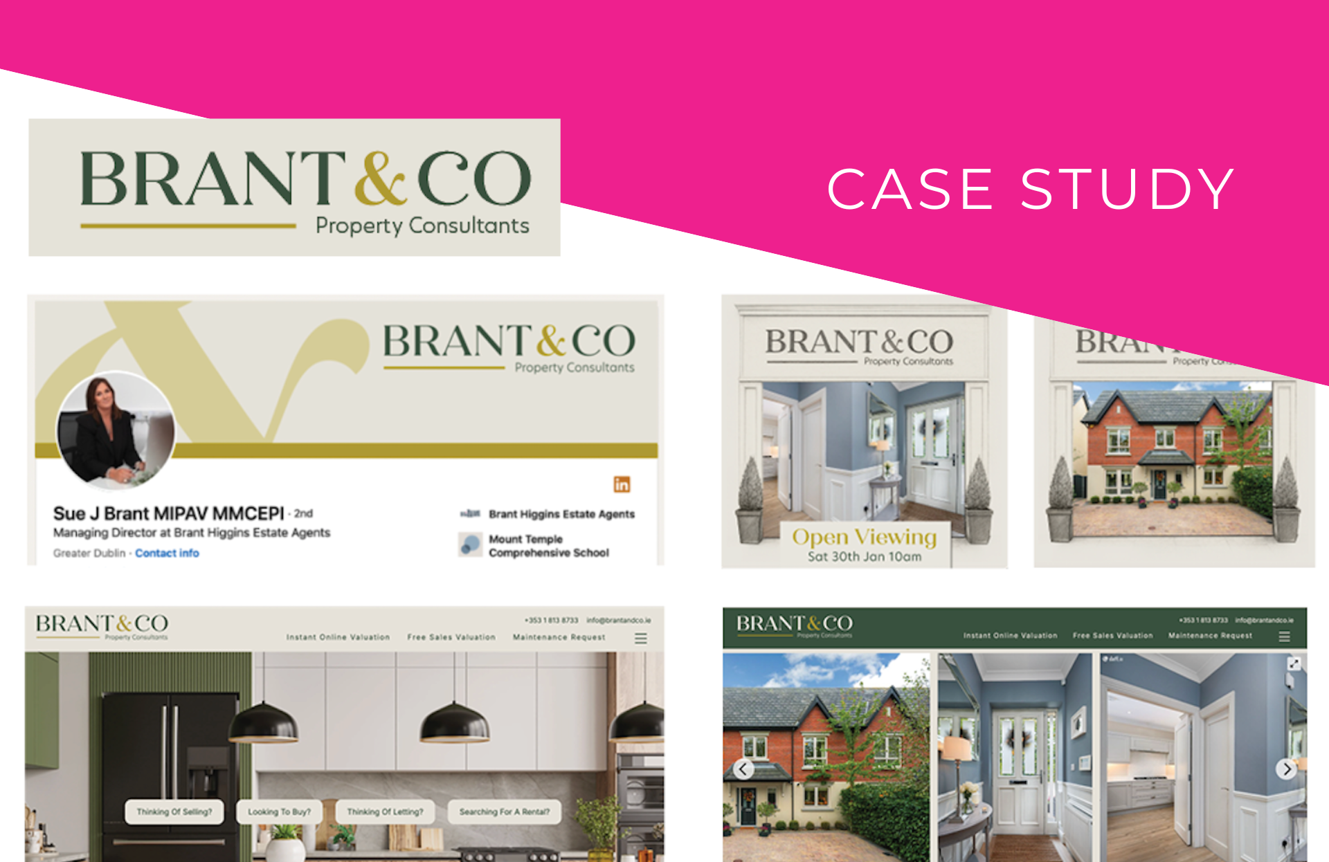
Reimagining a Trusted Dublin Property Consultant
Brant & Co launched an exciting rebrand with Grey Dog's help: new name, fresh visual identity and improved messaging for a brand rooted in community yet designed to live digitally first
Written by: Daniella Mendoza
Small businesses, like families, change from generation to generation. It's not about becoming AI savvy or taking big leaps for the sake of it, but about adapting to the needs of their teams and communities. Many businesses recognise they need a fresh start, but figuring out which steps and direction to take can feel confusing.
A legacy has been painstakingly built, how do we make sure it doesn't become a footnote as we turn the page to a new chapter?
We answered this exact question when we took on a rebranding project for Brant & Co. A property consultancy based in Swords, this boutique-style agency was adopting a new name and they needed a fresh brand identity to go with it.
So, what does a rebrand like this entail? Each case is unique, but it usually means crafting a consistent story and visual identity for the business. In other words, rethinking messaging, logos, colourways and style guides, as well as going for a website makeover and a LinkedIn page re-launch.
Keep reading to find out exactly how Grey Dog's design, strategy and content teams tackled this rebranding project!
The brief
A family-led rebrand marking the next chapter of a 20+ year legacy. After over two decades as Brant Higgins, the business entered a pivotal moment: new leadership, a generational shift, and a need for a modern identity that continues to honour their deep local roots.
The goals for this collaboration were clear:
Preserve trust and heritage.
Introduce warmth, family, and modernity.
Build a brand designed to live digitally first.
Leading this new chapter is Sue J. Brant, whose dedication and warmth have long defined the brand. The Brant & Co era is shaped by her own vision and values, with trust, family, and a modern approach to client care at its core.
The opportunity
Brant & Co is more than a new name. It’s a reimagining of what a property consultancy can be: modern, approachable, and proudly local, yet grounded in decades of experience and care.
With Grey Dog’s guidance, this rebrand offers the opportunity to present a refreshed identity that embraces modern design, digital connection, and a renewed sense of purpose.
The hands-on work
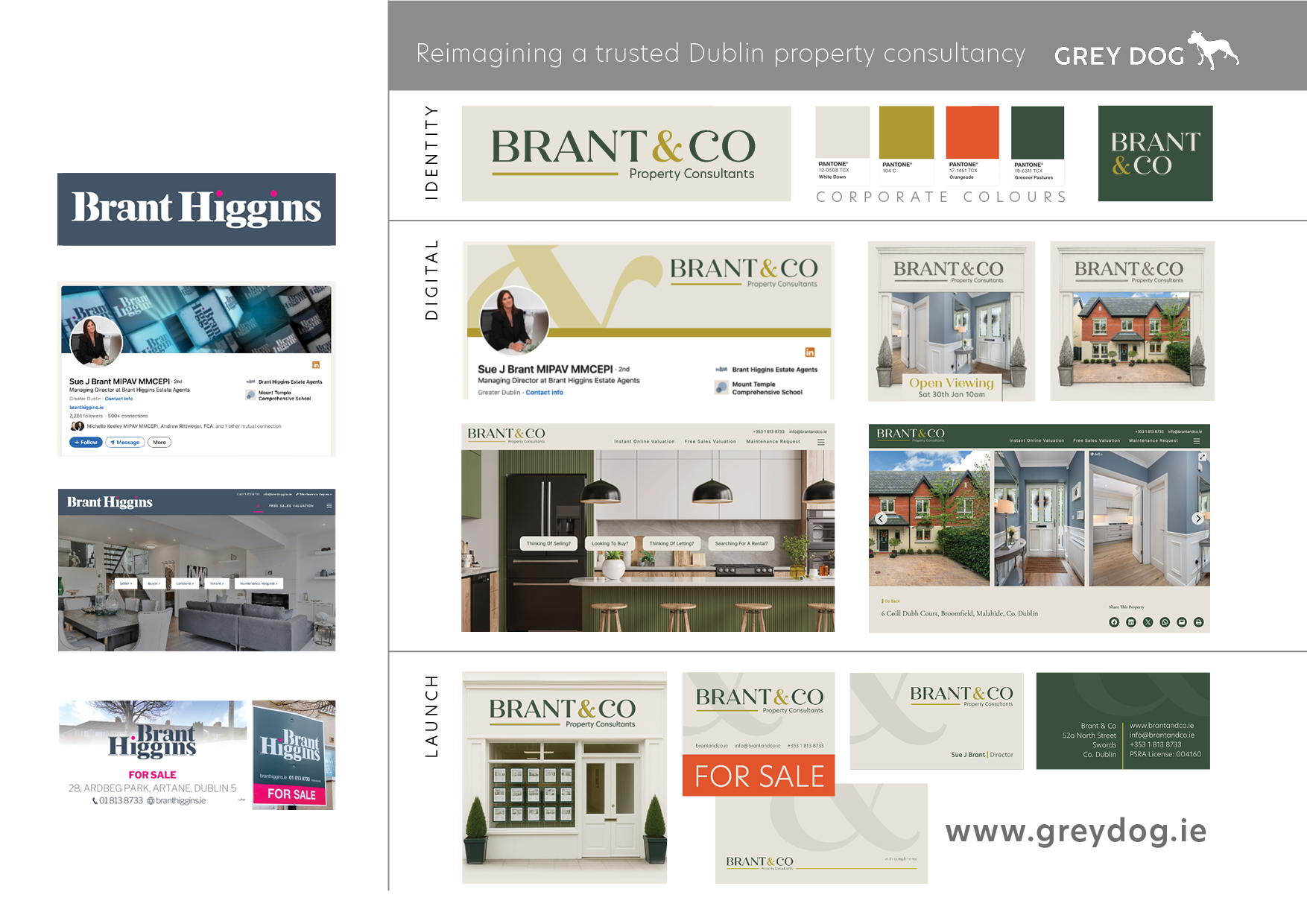
At Grey Dog, we see every rebrand as a shared journey built on communication, creativity, and clear outcomes. For Brant & Co, we worked on four core areas of transformation:
Design: Logos built in appropriate formats, brand colours for on-screen and print, brand visual identity and a brand guidelines document. Everything they needed to roll out the new brand across a variety of mediums. "I enjoy working on rebranding projects because they combine creativity with problem-solving," says Michele, Grey Dog's Head of Design. "With Brant & Co, we were able to take the design & colour palette in a totally new direction, making it feel both current & reliable."
Content: The words need to match image; that's why reviewing the brand messaging and story is fundamental in any rebrand. It's not just a facelift, but an opportunity to reconnect with your core purpose —and with your customers. For Brant & Co, we reworked current content to ensure it communicated the transition, highlighted the new path ahead and still upheld the values the company has long stood for. This included both website content and content for social channels.
Digital assets & announcement: A collection of designed assets for social channels with the new brand identity and language, including post templates, a LinkedIn hero image and a new 'about' section. We also drafted and designed assets for a 'launch sequence' announcing the rebrand across social channels.
Website refresh: Grey Dog supported the transformation of the Brant Higgins website into Brant & Co by preparing content, imagery and brand collateral and collaborating with their developers in the implementation of these changes.
The result
Brant & Co successfully launched into their new era with a strong, stand-out visual identity and the confident messaging to go with it. The refreshed website and socials assets cemented of a cohesive, modern brand presence and set up the business for real growth in the digital sphere.
For the Grey Dog team, working on rebrands is exciting —it feels like we are giving brands the push they need to reach their potential. Although we offer plenty of guidance, we also take the time to listen: clients tell us their 'how I got here' story and share their ambitions going forward.
That's where we begin to craft an identity that makes sense to them, first of all, and engages with their customers, too. This goes for both the written content and the design process.
"Instead of starting from scratch, I like to look at the journey the brand has been on & reshape it into something stronger and more relevant, to better reflect the organisation’s current goals and audience." Michele Brosnan, Grey Dog's Head of Design.
Taking a business' history, culture and values into consideration during this process is essential, because without it the result can hardly be authentic and cohesive —the two elements you must guarantee. Without them, a show-stopping logo will have no depth or legs to stand on. It's about respecting the legacy while creating something new.
In Michele's words: "There are often existing expectations in rebranding projects. Because people are already familiar with the brand, changes need to be carefully balanced so the design feels fresh without losing or alienating the existing audience."
Balancing continuity and novelty is why rebrands are one of the more challenging and fascinating work we do at Grey Dog. If you're interested in our branding services, reach out and find out if we are a good fit.